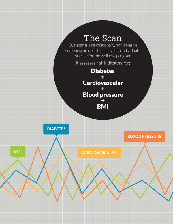
Wellness by Cypress consisted of a wellness insurance policy, a health assessment that utilizes cool bioscanning technology, and a game-style app to help users make and meet wellness goals, track participation and progress, and get educated. As the concept is entirely unique in the marketplace, the sales process requires a lot of complex information to be related in as clear a fashion as possible.
The Game
The core of the wellness program is a web application that educates users in healthy habits, helps them set and achieve personal goals, and tracks their progress. It also boasts a social function; players compete with other people in their organization to win prizes based on their participation and personal wellness.
The game receives data from two separate automated systems, an insurance enrolling tool and a health scanning device. The system employs a variety of web technologies, and has alternate displays depending on the device being used to read it.
The Cartoon
We put together this cartoon (kinda goes along with their other insurance cartoons) to explain the philosophy and make people think wellness is fun!
The Brochure and Collateral
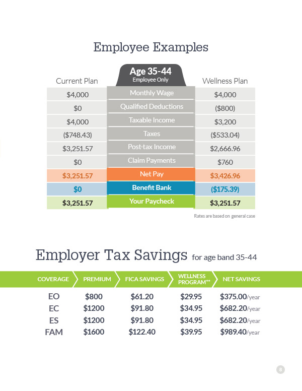
Cypress’ unique wellness program requires some pretty thorough explaining every time it’s presented. Some situations allow for a slideshow-style presentation, but there’s too much information for attendees to be expected to digest in one go. And of course, projectors and screens are absent in many situations, which can make graphic representations a little bit unrealistic.
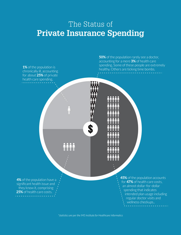
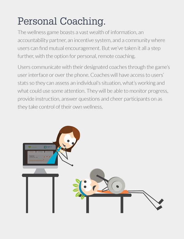
As a solution, we developed a 20-page, detailed brochure that’s rich in imagery, diagrams, data, and narrative-style explanations. It’s an exhaustive description of the complete program, that meeting attendees can take away and reference later. It also serves to promote consistency in the sales process among a vast sales force. A more graphic-rich version of this document was then distilled into a slideshow for large groups, which parallels the brochure.
